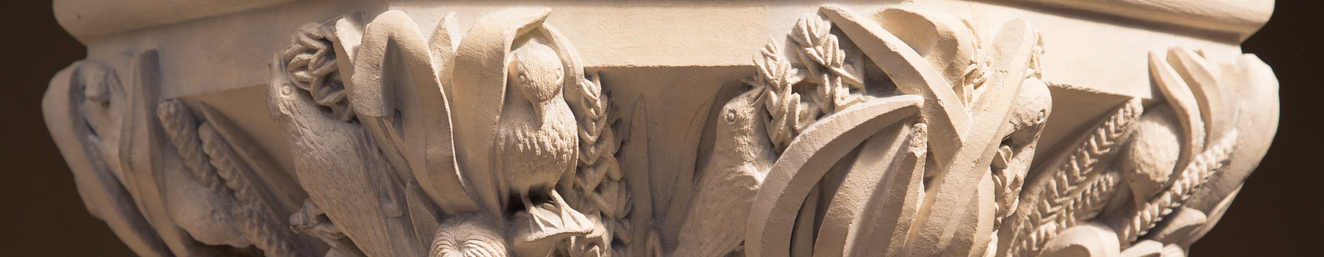

Our Settlers exhibition tells the story of the peopling of Britain, from the arrival of the earliest modern humans over 40,000 years ago to the population of the present day. At the centre of the exhibition is a genetic map of Britain – the first of its kind to be produced of anywhere in the world. But what exactly does this map show us and how was it created? Brian Mackenwells from the Wellcome Centre for Human Genetics explains…
While maps can be used to show us where we need to go, the one at the heart of the People of the British Isles study was used to show us where we’ve been. Researchers from the Wellcome Centre for Human Genetics wanted to reach back through time by looking at our genetic code.
We obviously can’t travel back a hundred years and sequence people’s DNA, so the next best thing is to sequence the genome of people whose grandparents were all from the same rural area. This is because people in rural areas at that time had a tendency not to travel very far, so the researchers guessed that the genes of their descendants would be like (slightly jumbled) snapshots of the genetic history of the area they were from.
This video, commissioned from Oxford Sparks especially for the exhibition, expands on this idea.
So the People of the British Isles researchers sequenced the DNA of just over 2,000 people and set to work analysing it all. The scientists looked for individuals with common genetic patterns and grouped them together. They had no idea where the individuals were actually from; the system just grouped people whose small genetic variations seemed to be the most similar to each other.
Here’s an example of the process. Imagine you were presented with a list of colours like these and asked to group them.

You would probably group them something like this:

There would be a ‘sort of red’ group, a ‘sort of green’ group, and a ‘sort of blue’ group. This is what the pattern-matching system was trying to do with genetic codes: make clusters of people who seemed to be similar to each other based on very small genetic variations.
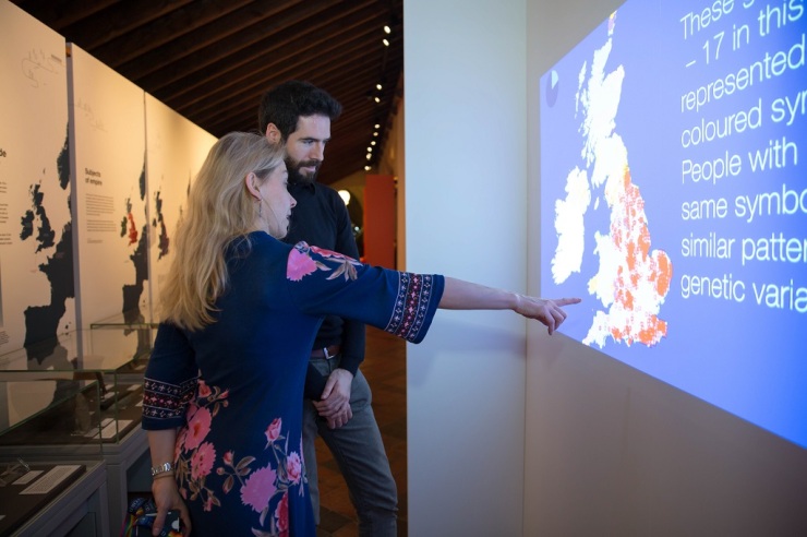
But the really surprising bit came next. We took each individual in the study and plotted them on a map of Britain based on the location of their grandparents, using a symbol to denote which genetic cluster they had been placed in.
We weren’t sure what to expect. Would the symbols be spread out randomly over the map, or would there be groupings? What might the groupings mean?
The result was striking: the genetic clusters are, for the most part, linked to quite specific geographical areas, as you can see in the final map here.

What is this map revealing to us? When we compared these different groups to the unique genetic markers of different European populations, working with archaeologists and geographers, we were able to start to understand the meaning of the map. You can clearly see the genetic footprints left by historical migration and events from hundreds of years ago. The video below explains more about this.
The locations of many of the clusters correspond to regions controlled by known historical tribes and kingdoms. The map also shows how places like Northern Ireland and Western Scotland seem to share a genetic heritage.
You can learn more about the map, and the things we’ve learned from it, at the Settlers exhibition until the 16 September 2018.

[…] A Genetic Map of Britain – Oxford University Museum of Natural History Blog […]
[…] A Genetic Map of Britain – Oxford University Museum of Natural History Blog […]
[…] A Genetic Map of Britain – Oxford University Museum of Natural History Blog […]